
How to choose colours for a painted timber kitchen

Personally designed. Nationally supplied.
Choose colour with confidence.
Colour is usually the first thing people notice in a painted timber kitchen, but it is rarely the first thing I would decide in isolation. A door colour needs to work with the natural light in your room, the undertones in the floor and worktop, and the amount of contrast you want to live with every day. The right scheme can make a kitchen feel calm and settled; the wrong one can look unexpectedly cold, yellow or heavy once it is fitted.
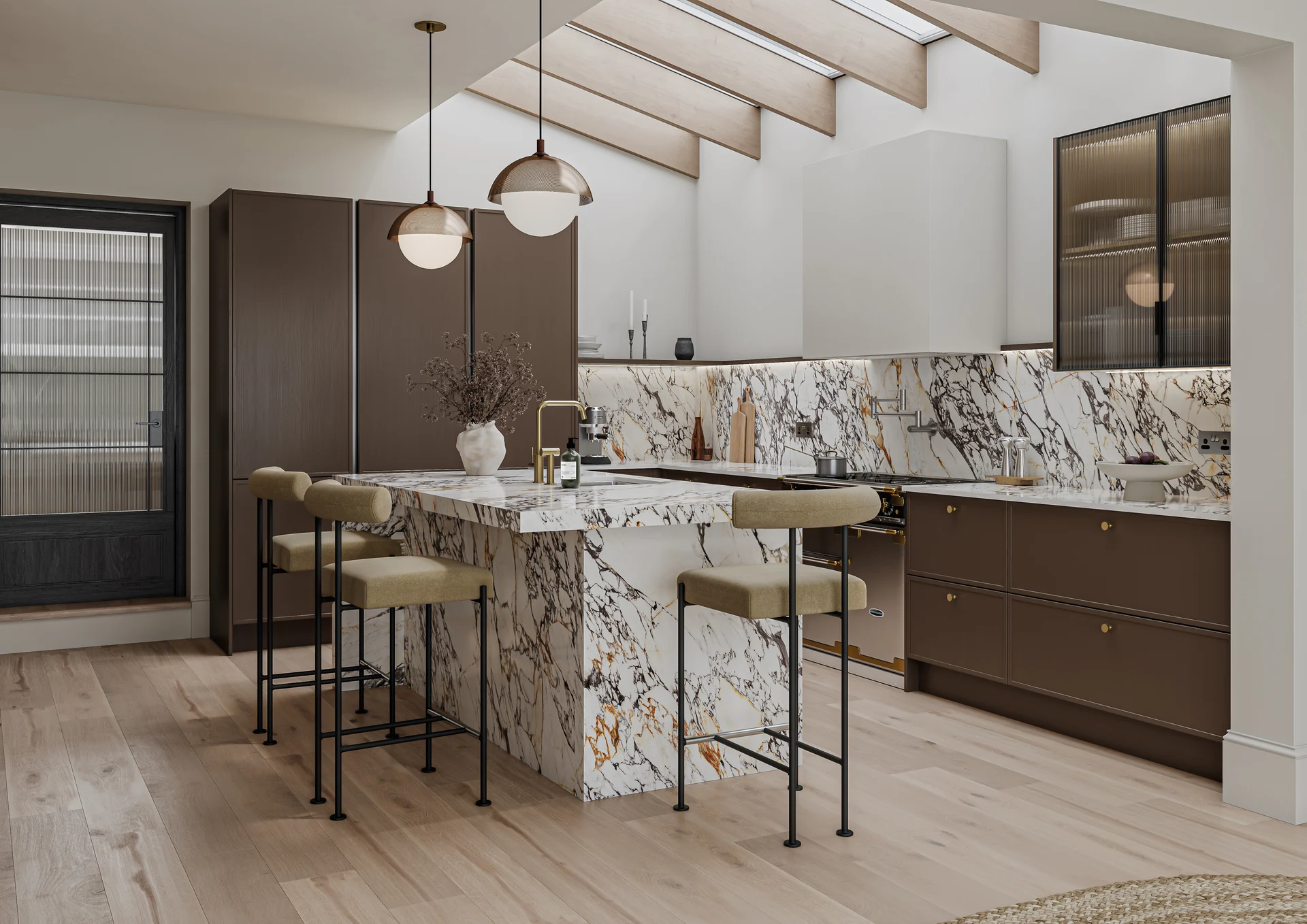
My advice is to treat colour as part of the whole room. Start with the fixed elements you are keeping, then test your preferred painted timber shades against them before you commit.
Start with the daylight in your kitchen
North-facing rooms often receive cooler, bluer light. A clean white or blue-grey can therefore feel sharper than it did on a colour card. Warm off-whites, soft greys and gentle green or taupe undertones can help the room feel more balanced. In a south-facing kitchen, strong sunlight can make warm colours look much yellower and can lift a pale shade considerably.
East- and west-facing rooms change more noticeably through the day. Morning light may be bright and warm in an east-facing room, while a west-facing room can look subdued earlier and golden later. If you use the kitchen at different times, check your samples in morning, afternoon and evening light rather than judging them during one quick visit.
Room size matters, but it should not rule out a deeper colour. In a small kitchen, a darker painted door can still work when the worktop, walls and lighting give it enough breathing space. Conversely, an all-white scheme is not automatically bright if the room has little daylight or the surrounding finishes are cool.
Understand warm and cool undertones
Two colours can look similar on a screen and behave very differently beside your existing finishes. Warm colours tend towards yellow, red or brown. Cool colours tend towards blue, green or violet. Undertones are subtle, but they often explain why a sample feels right in the shop and wrong at home.
Hold the door sample beside your wall paint, floor and worktop. If the worktop has warm veining or honeyed timber, a slightly warm neutral may connect the room more naturally than a blue-based grey. If your floor and worktop are cool stone tones, a cool or balanced door colour may feel more coherent. You do not need every surface to match; you do need the undertones to be comfortable together.
Test real samples, not just colour cards
A small printed swatch is useful for an initial shortlist, but a real painted door or larger sample tells you much more. You can see how the colour sits on the door profile, how the paint changes across a frame and centre panel, and how the surface reflects or absorbs light.
Move the sample around the room. Put it beside a window, under a wall cabinet, next to the oven housing and close to the floor. Look at it vertically as well as flat on a worktop. Leave it in place for a few days and take photographs at different times. Phone cameras can shift colour, so use photographs as a prompt rather than as proof.
If you are comparing two near-identical neutrals, place them side by side on the same wall. A surrounding white wall can make a warm shade appear warmer, while a dark floor can make a pale door look lighter. Testing the complete combination is more reliable than trying to remember how each sample looked on its own.
Use the floor and worktop to set the direction
Your floor is a large horizontal colour field, so it can influence the whole scheme. Timber flooring introduces grain and warmth. Stone, concrete and stone-effect finishes may be cooler or more varied. If the floor already has a strong pattern, I would usually keep the door colour relatively quiet and let the worktop or handles provide smaller points of interest.
The worktop sits directly against the doors, making its undertone especially important. A pale worktop can create a crisp contrast with a mid-tone painted door. A timber worktop softens a painted colour and can make a simple Shaker scheme feel more relaxed. A veined stone-effect surface may already contain several colours, so choose a door shade that picks up one of its quieter tones rather than competing with the pattern.
For more detail on choosing a surface for daily use, see my guide to kitchen worktop materials and durability. If you are still deciding between door constructions and finishes, the kitchen materials guide explains what sits behind the painted finish.
Keep an island contrast understated
A two-colour kitchen can be effective, but the island does not need to become a second feature wall. I often prefer a restrained contrast: the same family of colour in a slightly deeper tone, or a quiet neutral against a more characterful perimeter colour. This gives the island definition without making the room feel divided.
Think about what the island faces. If it is opposite a tall run of doors, a strong contrast will be seen across the whole room. If it sits between the kitchen and living area, a softer relationship may help both spaces feel connected. You can also keep the island colour close to the main doors and introduce contrast through the worktop, stools or handles instead.
Explore the range, then make the scheme personal
Painted timber frames can give a kitchen depth and a pleasing sense of detail, but the best colour is still the one that suits your room and your routine. SJB’s painted timber kitchen collection brings together selected ranges, including the Mornington Shaker, Mornington Beaded, Mornington Vale and Crathorne styles. The available painted palette depends on the chosen range and should be confirmed with your quote; I would never choose a colour based on an assumed number of options.
Some current palette examples shown for Aalborg include Fawn, Truffle and Copse Green, but a named example is not a substitute for a physical sample. Range and finish details should be checked with the relevant supplier information and confirmed for your project. SJB is not affiliated with the independent manufacturers linked from those range references.
Begin with a room, not a colour name
When you are ready, begin your kitchen journey with SJB. You can share a plan or sketch, tell me about your preferred style, floor and worktop, and explain who will be handling installation. I can then look at the colour as part of the layout rather than treating it as a disconnected sample choice.
Your questions, answered
Should I choose the kitchen colour before the worktop?
Usually it is best to shortlist both together. Worktops and floors often have fixed patterns or undertones, so test the painted timber sample beside them before making a final decision.
How many paint samples should I test?
Start with three or four genuinely different directions, then narrow them to two or three larger real samples. Testing fewer, larger samples is more useful than collecting lots of small colour cards.
Can a dark colour work in a small kitchen?
Yes. Daylight, wall colour, lighting and the worktop all affect the result. A darker door can work well when the surrounding finishes provide contrast and the scheme is tested in the actual room.
Is a contrasting island always a good idea?
No. A contrast can define the island, but a close tonal variation or contrast through the worktop and handles may feel calmer. Consider what the island faces and how visible it is from adjoining rooms.
Let’s start with your home
A kitchen that feels like you.
Share a floor plan, draw your room online or upload a quote you already have. Tell me the style you love and I’ll help you plan your next step.
Begin your kitchen journey with SJB →
Upload your existing design or quotation in the planner. We can look at the layout, specification and what is included in an SJB proposal — without assuming two kitchens are identical.
Free to start, with no obligation. Design and supply scope confirmed in your quotation.


